


Next: Conclusions from the mean
Up: Measurements
Previous: Monthly average tables
Weekly mean plots
In this subsection some plots with weekly average values are shows. As
in section 4.1 these plots are intended to
give an impression of the development of the network during the
monitored period. The plots are derived from the Applet plot window
which is a fragment of the net performance monitor Web pages.
The following figures with monitor data plots are presented below:
- Figure 2 shows the
minimum roundtrip values for all ATM (top plot) and Internet
(bottom plot) connections. The y-scale of the bottom plot is
logarithmic.
- Figure 3 shows the
average roundtrip values for all ATM (top plot) and Internet
(bottom plot) connections. The y-scale of the bottom plot is
logarithmic.
- Figure 4 shows the
maximum roundtrip values for all ATM (top plot) and Internet
(bottom plot) connections. The y-scale of the bottom plot is
logarithmic.
- Figure 5 shows the
throughput values for all ATM (top plot) and Internet (bottom
plot) connections.
Figure:
Plots of the weekly mean minimum roundtrip values
plotted for all ATM (top plot) and Internet (bottom plot)
connections. The y-axis of the bottom plot is
logarithmic. Show the
top plot
or the
bottom plot
in real size.
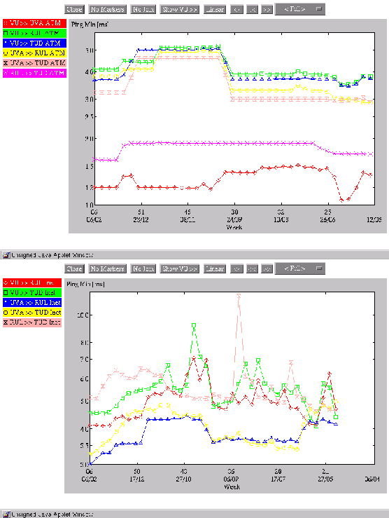 |
Figure:
Plots of the weekly mean average roundtrip values
plotted for all ATM (top plot) and Internet (bottom plot)
connections. The y-axis of the bottom plot is
logarithmic. Show the
top plot
or the
bottom plot
in real size.
|
Figure:
Plots of the weekly mean maximum roundtrip values
plotted for all ATM (top plot) and Internet (bottom plot)
connections. The y-axis of the bottom plot is
logarithmic. Show the
top plot
or the
bottom plot
in real size.
|
Figure:
Plots of the weekly mean throughput values plotted for
all ATM (top plot) and Internet (bottom plot)
connections. Show the
top plot
or the
bottom plot
in real size.
|
Some direct conclusions from these plots are presented in
subsection 4.3.
Next: Conclusions from the mean
Up: Measurements
Previous: Monthly average tables
Hans Blom
2000-03-28